CTRL ENERGY

Branding / Packaging / Motion

Project Summary
A conceptual brand exploring clean, minimal energy drink design through packaging, motion graphics, and social advertising.

The Challenge
Most energy drinks are loud and chaotic. CTRL set out to imagine a calmer, more modern approach built for focus.

The Goal
Create a tech-inspired visual system that communicates clarity, balance, and controlled energy across all touchpoints.

Label Design 
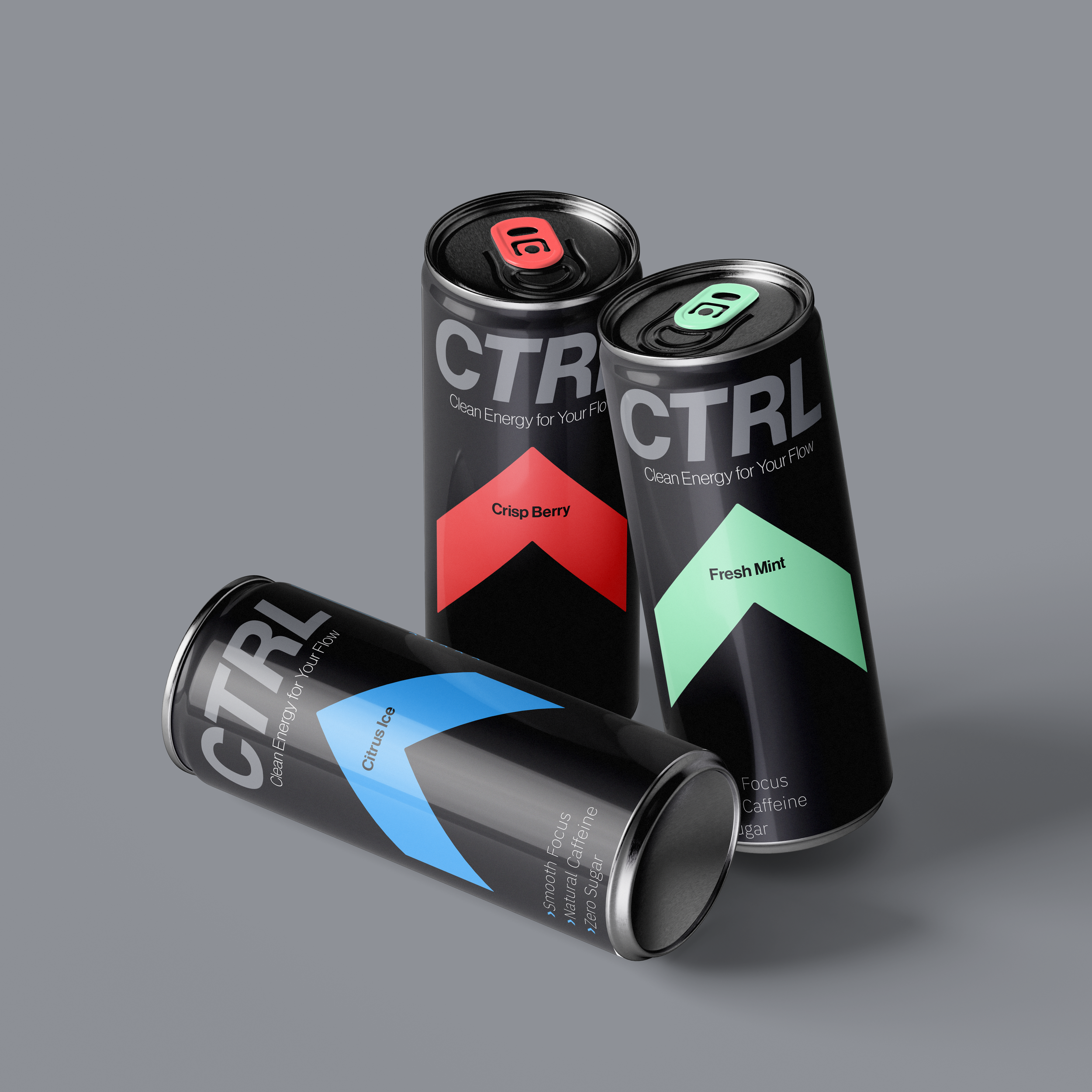
Three cans of energy drink with black labels featuring colorful diamond-shaped accents and flavor names, placed on a gray background.

Motion

Social

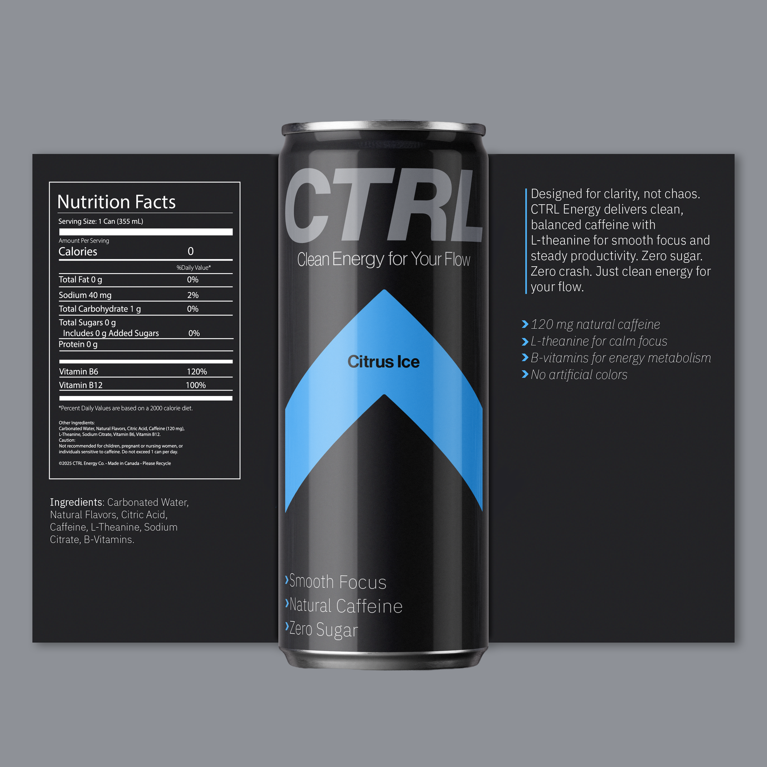
A black energy drink can with blue and gray accents, front label displaying the brand name and product information, and nutrition facts panel visible on the left side. The can is set against a plain gray background.
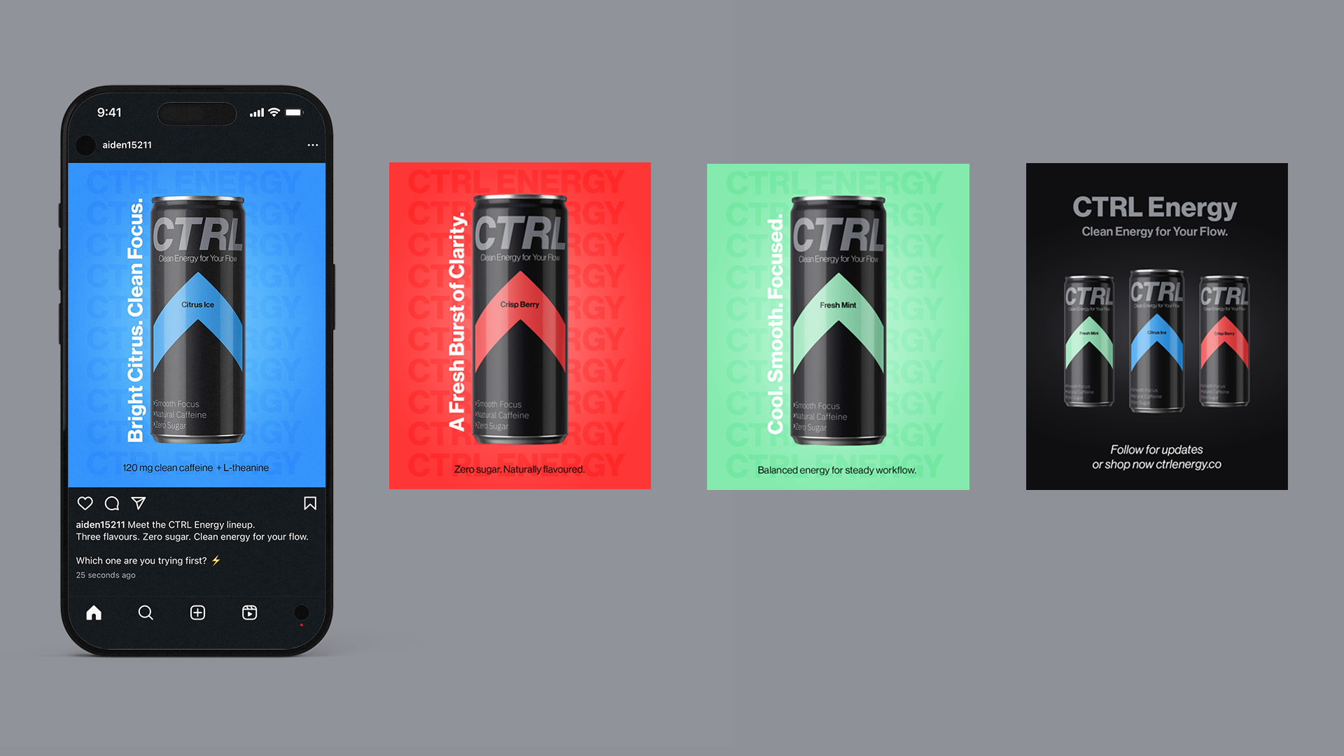
Display of three CTRL Energy drink cans in different flavors—Citrus Ice, Crisp Berry, and Fresh Mint—along with a promotional poster showing all three cans and branding details.